Featured

Analyses of an Ad and its Reverse Engineering – John Sullivan

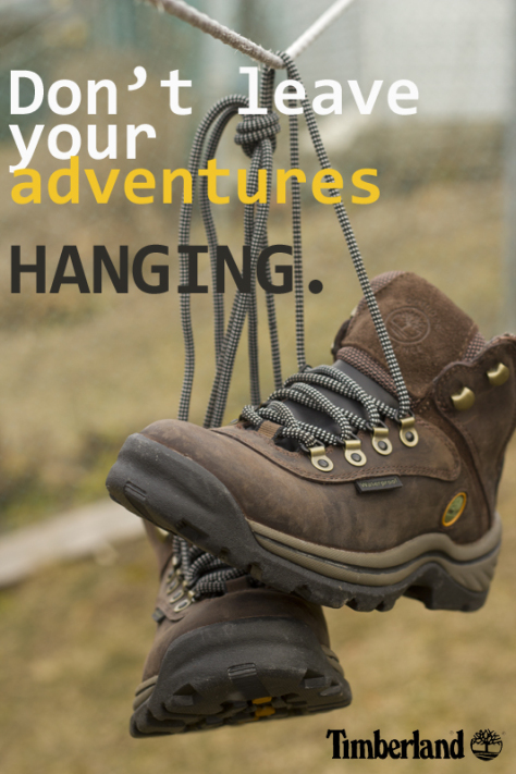
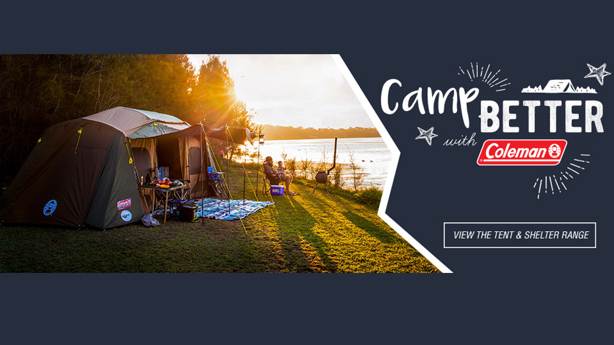
The above design can be attributed to the Coleman website of New Zealand. I could not find the designers name, though. The ad contains brief information for who and what Coleman is. They are a outdoor and camping gear supplies company, dedicated to providing consumers with a more comfortable outdoors experience.
https://www.google.com/url?sa=i&url=https%3A%2F%2Fwww.colemannz.co.nz%2F&psig=AOvVaw1YJ5849SG6rbCPBIULVjiu&ust=1584678574554000&source=images&cd=vfe&ved=0CAMQjB1qFwoTCNjl7O_ZpegCFQAAAAAdAAAAABAJ

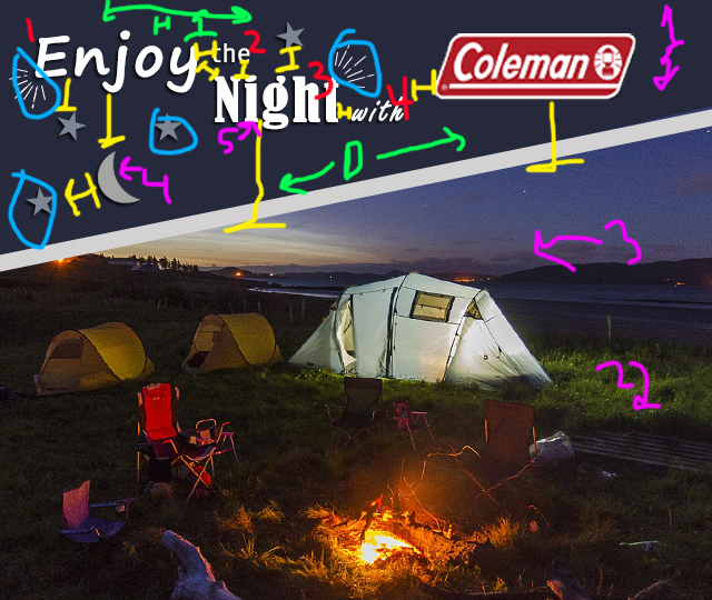
Original ad analyses
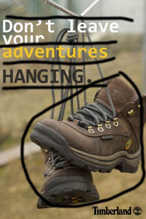
Design: Contrast (Purple Pinkish) – The color contrast of cools and warms of the white, blues, yellows, and greens really fit well together. The typography contrasts through the multiple chosen typeface.
Repetition (Light Blue) – The main repetition used here is with the drawn on designs near the typeface.
Alignment (Light Green) – Alignment is mainly horizontal, but with some diagonal themes as well.
Proximity (Yellow) – The Typeface and the drawn designs are very close together with each other, yet some distance from the photo. The people in the photo are just a little ways off from the tent to show they are enjoying themselves with their products.
Color: The colors used are like I said before, warm and cool mixed. This brings a good flow to the ad from text to photo.
Typography: There are three different typefaces used (not including the logo). They use script, sans-serif, and decorative mixed in there. They all flow and compliment each other well despite the differences.

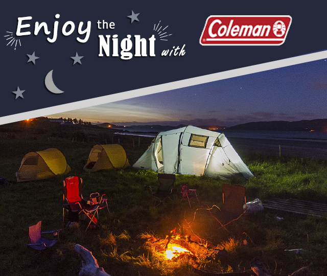
This is the new ad I created as a reverse engineering of the other post.

NEW AD ANALYSES
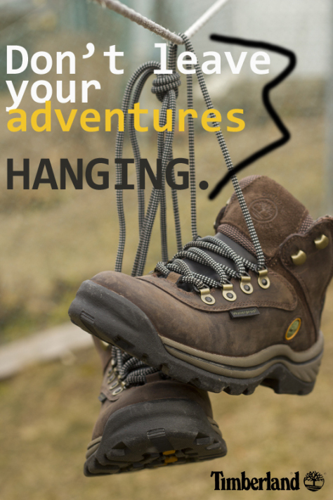
Design: Contrast (Purple Pinkish) – As with the original, I made sure there was a mixture of warm and cool color contrasts.
Repetition (Light Blue) – I used the same design repetition with the lines and the stars.
Alignment (Light Green) – Alignments are the same, though on the opposite side of the ad.
Proximity (Yellow) – The proprieties are similar though a little more spread out as the type goes. And there are no human subjects in the photo.
Color: Warm and cool, blues, whites, a gray I added to the drawn designs, and the natural warms and cools of the photo.
Typography: I used 4 different types to go with the theme of every word used a different one since I added one. I used script and sans-serif. In retro-spec I realize I forgot to use the decorative.

Conclusion
The original ad and the new ad work well together in my opinion, as they bring the same elements to the advertisement. The message is similar, “Camp Better with Coleman” and “Enjoy the Night with Coleman” create an idea that the consumer will have a better camping experience with Coleman products. The ultimate design of the ad is similar enough. Though I will probably scale my new ad to more of the scale of the original when I complete the next project. Overall, I feel they work well for the same campaign.

Type & Photography: The Reverse Engineering of a Magazine Spread

By John Sullivan

The magazine spread comes from a magazine published by Guitars.com. The direct link to the magazine can be found at https://guitar.com/news/july-issue-2/ which is a website based solely around guitars (if the name isn’t obvious enough).

Category Identification

From what I can see the heading typeface falls into the Decorative category, and the paragraph typeface seems to falls into the Slab Serif category. The Decorative is fairly easy to spot as it is created/edited with a fun impression. While the Slab Serif if you can see the horizontal serifs and the vertical stress’s.

The contrast present in this magazine is fairly obvious with the stark differences between the Decorative and the Slab Serif typefaces. Yet, they work well together, and look clean. The colors and contrasts work well together and blend well with the background/scene.

From what I can see, the photo is relying on leading lines in order to draw the readers eyes to the guitar. With the natural guitar strings and with most of the objects lying around the guitar.

Alternate Images for Layout

The first photograph is the closest mimic to the original, with tools, guitar items, and even the wood slats creating leading lines to the guitar. The second photo created a simpler look with just a tape measure to help create leading lines while keeping the meaning of guitar repair in their as well. The third photo was vertical to create a different aspect on it. The tools are creating leading lines up to the guitar while the strings lead downwards.

Summary

The different typefaces brought a somewhat gritty, yet clean feel to the magazine. This contrast gives the impression I am sure they were going for. Which is that this is a cool guitar magazine article. The photograph draws the attention where it is needed; that the object of the page is the guitar and the article is about fixing it.

Timberland Boot Ad

Timberland hiking boot ad I got off of google images. The link brought me to another project created by a student from an unknown class and university, as the student was using this image. https://thoughtsunfound.wordpress.com/2012/03/07/shoe-ad/

The contrast is between the many colors chosen for the text, as well as the brown boots against the green background.

The repetition may be minor, but it is there. It is found in the font used in the ad.

The alignment is flush in the top left corner and bottom right corner. The text and the boots are taking up about the same amount of space it seems to the eye.

The proximity may seem all over the place at first, but the boots and the text proximity is based on how far they are from the margins of the image. The text also contains a play on words.

The color is based off a fairly simple palette. The brown and green go well together, as do the chosen text colors, which are meant to pop.

The ad chosen is simple and clever. The use of the word “hanging” as a line hanging off from the rest of the sentence is quite fun. The use of colors was warm and well contrasted. The ads use of boots hanging up against an earthy background is great. Everything was in good proximity and alignment of each other, well pleasing to the eye.

Introduce Yourself (Example Post)

This is an example post, originally published as part of Blogging University. Enroll in one of our ten programs, and start your blog right.

You’re going to publish a post today. Don’t worry about how your blog looks. Don’t worry if you haven’t given it a name yet, or you’re feeling overwhelmed. Just click the “New Post” button, and tell us why you’re here.

Why do this?

  • Because it gives new readers context. What are you about? Why should they read your blog?
  • Because it will help you focus you own ideas about your blog and what you’d like to do with it.

The post can be short or long, a personal intro to your life or a bloggy mission statement, a manifesto for the future or a simple outline of your the types of things you hope to publish.

To help you get started, here are a few questions:

  • Why are you blogging publicly, rather than keeping a personal journal?
  • What topics do you think you’ll write about?
  • Who would you love to connect with via your blog?
  • If you blog successfully throughout the next year, what would you hope to have accomplished?

You’re not locked into any of this; one of the wonderful things about blogs is how they constantly evolve as we learn, grow, and interact with one another — but it’s good to know where and why you started, and articulating your goals may just give you a few other post ideas.

Can’t think how to get started? Just write the first thing that pops into your head. Anne Lamott, author of a book on writing we love, says that you need to give yourself permission to write a “crappy first draft”. Anne makes a great point — just start writing, and worry about editing it later.

When you’re ready to publish, give your post three to five tags that describe your blog’s focus — writing, photography, fiction, parenting, food, cars, movies, sports, whatever. These tags will help others who care about your topics find you in the Reader. Make sure one of the tags is “zerotohero,” so other new bloggers can find you, too.

Design a site like this with WordPress.com
Get started