By John Sullivan
Category Identification
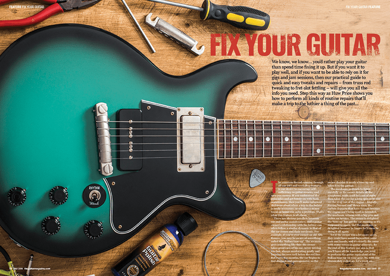
From what I can see the heading typeface falls into the Decorative category, and the paragraph typeface seems to falls into the Slab Serif category. The Decorative is fairly easy to spot as it is created/edited with a fun impression. While the Slab Serif if you can see the horizontal serifs and the vertical stress’s.
The contrast present in this magazine is fairly obvious with the stark differences between the Decorative and the Slab Serif typefaces. Yet, they work well together, and look clean. The colors and contrasts work well together and blend well with the background/scene.
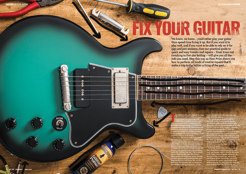
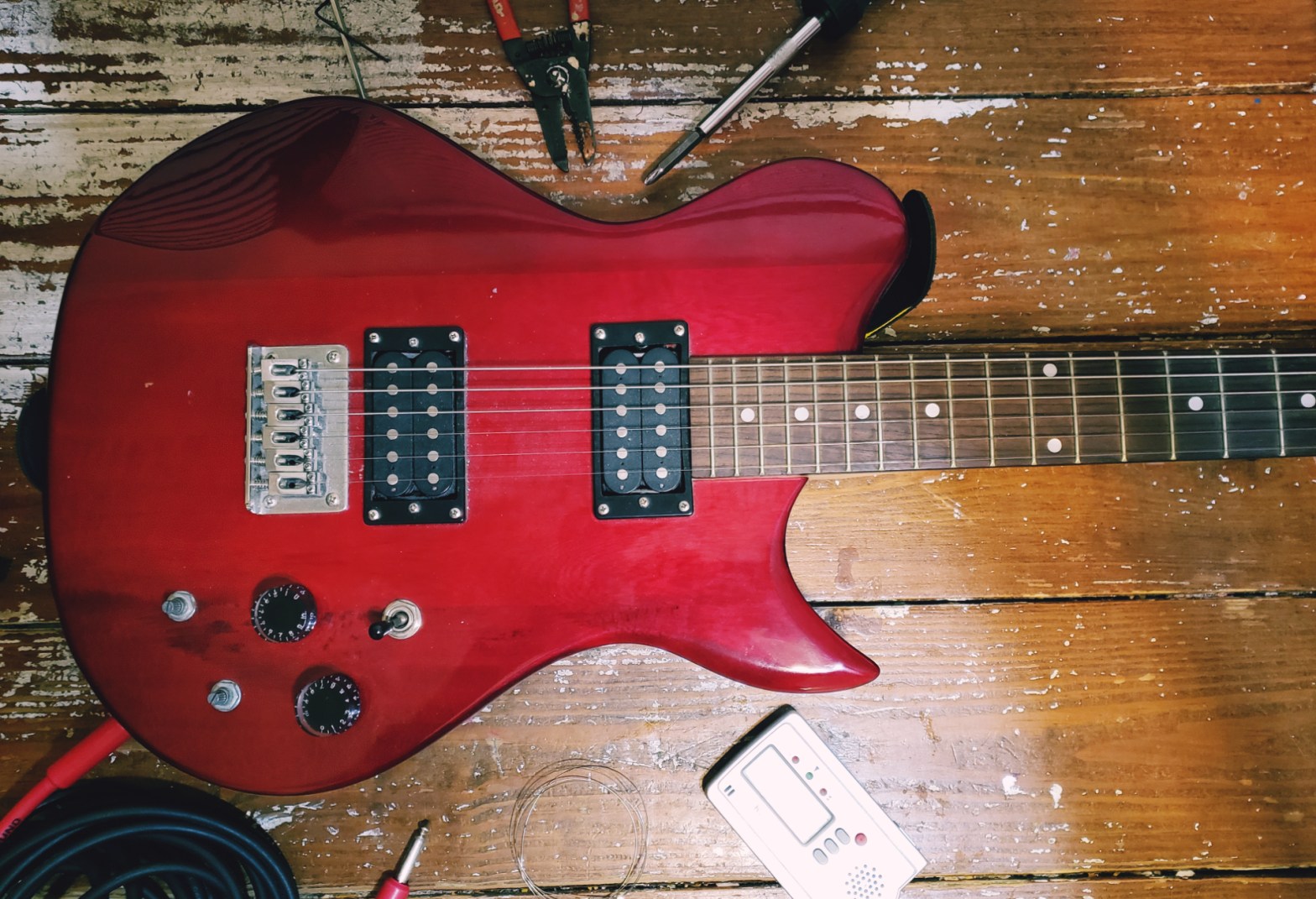
From what I can see, the photo is relying on leading lines in order to draw the readers eyes to the guitar. With the natural guitar strings and with most of the objects lying around the guitar.
Alternate Images for Layout
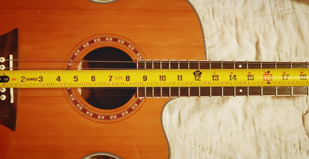
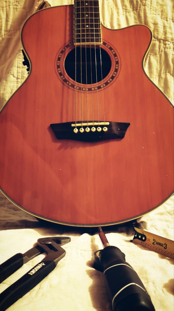
The first photograph is the closest mimic to the original, with tools, guitar items, and even the wood slats creating leading lines to the guitar. The second photo created a simpler look with just a tape measure to help create leading lines while keeping the meaning of guitar repair in their as well. The third photo was vertical to create a different aspect on it. The tools are creating leading lines up to the guitar while the strings lead downwards.

Summary
The different typefaces brought a somewhat gritty, yet clean feel to the magazine. This contrast gives the impression I am sure they were going for. Which is that this is a cool guitar magazine article. The photograph draws the attention where it is needed; that the object of the page is the guitar and the article is about fixing it.
