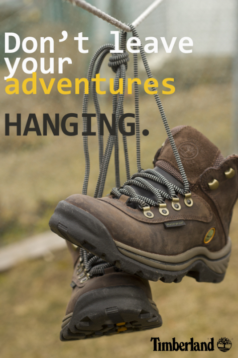
Timberland hiking boot ad I got off of google images. The link brought me to another project created by a student from an unknown class and university, as the student was using this image. https://thoughtsunfound.wordpress.com/2012/03/07/shoe-ad/
The contrast is between the many colors chosen for the text, as well as the brown boots against the green background.
The repetition may be minor, but it is there. It is found in the font used in the ad.
The alignment is flush in the top left corner and bottom right corner. The text and the boots are taking up about the same amount of space it seems to the eye.
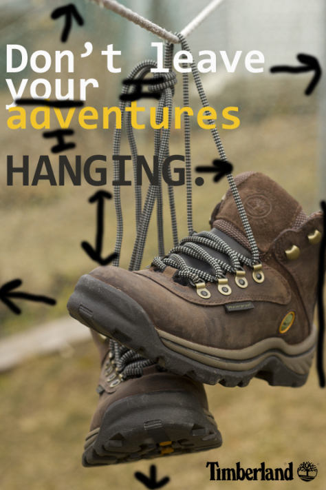
The proximity may seem all over the place at first, but the boots and the text proximity is based on how far they are from the margins of the image. The text also contains a play on words.
The color is based off a fairly simple palette. The brown and green go well together, as do the chosen text colors, which are meant to pop.
The ad chosen is simple and clever. The use of the word “hanging” as a line hanging off from the rest of the sentence is quite fun. The use of colors was warm and well contrasted. The ads use of boots hanging up against an earthy background is great. Everything was in good proximity and alignment of each other, well pleasing to the eye.
